Ultimate Guide to Reception Branding
A reception area is where brand promise meets physical reality — every furniture choice and material selection either reinforces your identity or undermines it. From three-zone layouts and commercial-grade seating to multi-stage walk-off systems for Boston's winters, this guide covers everything needed to brand a reception space that performs as well as it looks.
Post Summary
Reception branding is the deliberate design of a reception area to reflect a company's identity, values, and professionalism through every element — furniture, signage, lighting, color, materials, and sensory details — rather than treating the space as a functional afterthought. Every visitor forms an impression within the first minute of entering, and that impression is shaped by whether the space feels considered or generic. For Boston-area businesses, local factors including 49 inches of annual snowfall, compact urban floor plates in neighborhoods like Back Bay and the Seaport, and high foot traffic add material durability and smart layout requirements that generic design guidance does not address.
A well-designed reception divides naturally into three intuitive zones. The greeting zone is visible immediately from the entrance and anchors the receptionist or check-in function with clear sightlines from the door. The waiting zone is designed with intention — comfortable, functional, and equipped with practical features like integrated charging stations, side tables for personal items, and up-to-date reading materials. The transition zone guides visitors naturally from reception toward the rest of the office without requiring directions or signage to navigate. When the three zones work together, visitors move through the space intuitively — which is itself a brand signal communicating organizational clarity and attention to detail.
Signage materials carry their own brand message before the content is read: metal lettering conveys timelessness and authority, acrylic delivers a clean modern aesthetic, and wood signals warmth and approachability. Beyond logos, elements like mission walls, company timelines, and achievement displays communicate brand story in ways a logo alone cannot. For color, the most effective approach starts with a neutral base — soft whites, warm grays, or stone hues — layered with a secondary color range and a single accent color. This avoids visual clutter while emphasizing key brand elements. Bold branded colors work best on easily changeable elements like artwork and upholstery rather than on permanent architectural finishes.
Lighting sets the emotional tone of a reception area before any furniture or signage is processed. Statement pendant fixtures, indirect cove lighting, and accent lighting create depth and direct focus. Tunable LED systems that adjust color temperature throughout the day support natural circadian rhythms — energizing in the morning and calming by afternoon. Sensory branding extends beyond lighting: a law firm might choose understated tones and near silence to signal professionalism, while a creative agency might use low-tempo music and a signature scent to express energy. Biophilic elements like living plant walls, preserved moss panels, or timber accents reduce visitor stress and soften harder architectural features — with a single large-format plant or striking floral arrangement more effective than scattered small accessories.
Boston's climate — 49 inches of annual snowfall and over 43 inches of rain — means reception areas face water, slush, road salt, and sand for nearly half the year. A multi-stage walk-off system covering the first 15 to 20 feet is essential, using an exterior scraper mat, vestibule matting, and moisture-resistant commercial-grade LVT, porcelain tile, or sealed concrete. Reception desk and millwork surfaces should be high-pressure laminate or powder-coated steel, both durable enough for frequent cleaning under harsh conditions. Seating upholstery should be commercial-grade fabric rated at 100,000-plus double rubs on the Wyzenbeek test, or performance vinyls designed for damp clothing and regular cleaning — not residential-grade upholstery that degrades rapidly under commercial traffic.
Reception branding is about creating a reception area that reflects your company’s identity and values. It’s more than just furniture - every detail, from signage to lighting, contributes to the first impression visitors and employees have of your business. A well-designed reception space communicates professionalism, builds trust, and enhances the overall experience for anyone entering your office.
Key Takeaways:
- Signage: Reinforce your brand with clear, high-quality visuals like logos, mission walls, or timelines.
- Furniture & Layout: Use commercial-grade furniture and organize the space into greeting, waiting, and transition zones for intuitive flow.
- Color & Materials: Choose a neutral base with accent colors and finishes that align with your brand’s message.
- Lighting & Ambiance: Use lighting to set the tone, and incorporate biophilic elements like plants to create a welcoming atmosphere.
- Visitor Comfort: Include practical features like charging stations, accessible desks, and durable seating for all users.
For businesses in Boston, factors like climate, compact urban spaces, and high traffic require durable materials and smart layouts. Partnering with local design experts ensures your reception area meets these challenges while staying aligned with your brand.
Action Steps:
- Conduct a brand audit to define the desired look and feel.
- Create a design brief outlining goals, audience, and a clear budget.
- Work with professionals to plan and execute a reception space that balances style, function, and durability.
Core Components of Reception Branding
Furniture and Layout Design
The way furniture is arranged in a reception area speaks volumes about your brand - often before a single word is exchanged. Dividing the space into three intuitive zones - greeting, waiting, and transition - helps visitors navigate the area effortlessly.
"A reception room should guide behavior quietly. People should not need directions to know where to stand, sit, or move next." - Fiore Designs [2]
When choosing furniture, focus on pieces that balance style, durability, and comfort. Residential-grade furniture might look appealing but isn't built to withstand heavy use. Practical details matter too: provide side tables for personal items, ensure clear sightlines from the entrance to the reception desk, and eliminate clutter like tangled cords or mismatched seating. A thoughtful layout enhances the overall experience while complementing visual elements like signage.
Signage and Visual Identity
Signage plays a crucial role in grounding the space and reassuring visitors they’ve arrived at the right place. Beyond just displaying a logo, elements like mission walls, company timelines, or achievement displays can instantly communicate your brand's story.
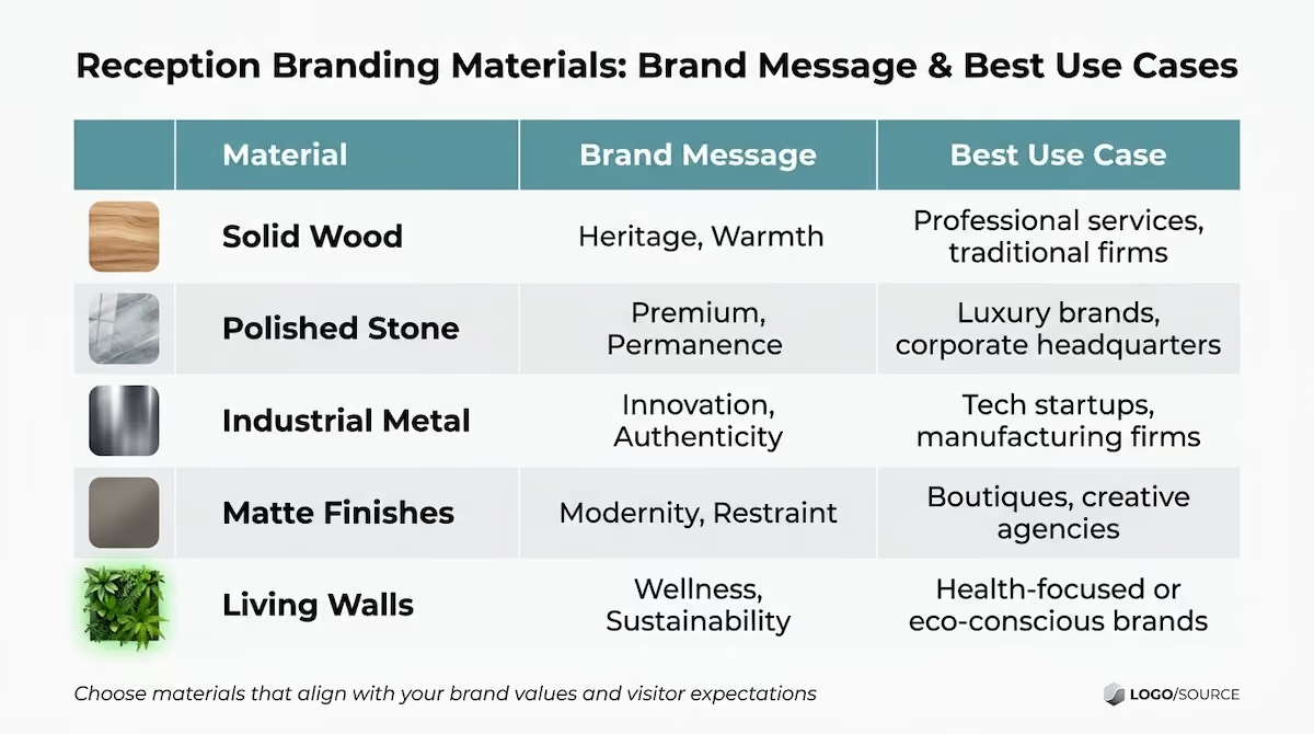
The materials used for signage make a statement of their own. For instance, metal lettering conveys timelessness and authority, acrylic offers a clean and modern aesthetic, and wood adds warmth and approachability. These choices should harmonize with the room's architecture and lighting, ensuring signage feels like an integral part of the design rather than an afterthought.
Color Palette and Finishes
A well-curated color palette and thoughtful finishes bring the reception’s visual identity to life. As Karl Carty, Design Director at OP Group, explains:
"Your reception area is where brand promise meets physical reality. Every material choice, every lighting decision, every spatial arrangement tells visitors whether your values are genuine or just words on a wall." [1]
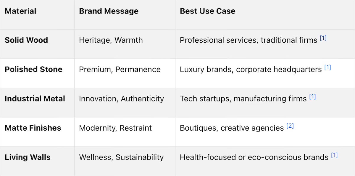
Start with a neutral base - like soft whites, warm grays, or stone hues - and layer in a secondary color range along with a single accent color. This approach avoids visual clutter while emphasizing key brand elements. Finishes such as matte metals, woven textiles, and wood accents tie everything together, creating a cohesive and inviting space. For brands focused on wellness or sustainability, features like living walls or preserved moss panels can reinforce those values in a meaningful way.
Creating a Welcoming Visitor Experience
Strategic furniture and layout choices set the stage, but a truly welcoming visitor experience goes deeper, reinforcing your brand's story in subtle, meaningful ways.
Lighting and Ambiance
Lighting does more than brighten a space - it sets the tone for how visitors feel the moment they enter. Statement pendant fixtures, indirect cove lighting, and accent lighting can add depth and direct focus. Consider using tunable LED systems that adjust color temperature throughout the day. This small yet impactful detail supports natural circadian rhythms, creating an energizing atmosphere in the morning and a calming one by afternoon - something visitors notice and appreciate.
"Design your reception as if every visitor's first impression depends on it - because it does." - Karl Carty, Design Director, OP Group [1]
But lighting is just one piece of the puzzle. The tactile and functional design of your reception area plays a big role in shaping the overall experience.
Comfort and Practicality
Comfort goes beyond plush seating - it’s about creating a space that works seamlessly for everyone. Commercial-grade seating is a must for high-traffic areas, as it withstands wear and tear far better than residential furniture. Look for thoughtful, functional touches like integrated charging stations, multifunctional surfaces, and up-to-date reading materials to accommodate visitors who may need to wait longer than expected.
Equally important is accessibility. Reception desks with varying heights make the space more inclusive for wheelchair users, while clear sightlines benefit individuals with hearing impairments. These thoughtful design elements show that your organization values every visitor. Many modern reception areas also include high-top tables with stools, offering a convenient spot for quick laptop work or informal chats. [1]
Sensory Branding in Reception Areas
Sensory design extends your brand identity beyond visuals, creating a more immersive experience. When done subtly, elements like scent and sound can reinforce your brand's personality without overwhelming the space. [2] For instance, a law firm might choose understated tones and near silence to convey professionalism and discretion, while a creative agency might opt for low-tempo music and a signature scent to express its dynamic energy.
Adding biophilic elements - like living plant walls, preserved moss panels, or timber accents - can reduce stress and soften the room’s harder architectural features. [1] However, fresh plants require consistent care to maintain their impact.
"Fresh design signals active attention. That is part of what visitors respond to, even when they cannot name it." - Fiore Designs [2]
Instead of scattering small plants or accessories throughout the space, focus on a single striking floral arrangement or a large-format plant to anchor the room. Every detail - lighting, scent, seating, and greenery - should work together to tell a unified story, creating a space that feels intentional and inviting at every level.
Planning and Executing Reception Branding
Once you've nailed down the sensory and experiential elements, it’s time to turn your vision into reality with a clear, actionable plan. The key is to organize every step before making any purchases.
Writing a Reception Design Brief
Think of a reception design brief as the backbone of your project. It sets the tone for every choice, from flooring to furniture, ensuring that each decision serves a clear purpose. Start with a brand audit: What should a first-time visitor feel within their first minute inside? Should the space reflect values like precision, warmth, or innovation? These answers will guide the overall design.
Next, pinpoint your primary audience. Different visitor types require different atmospheres, so tailor the space to their needs. Once you know who you're designing for, divide the reception into three distinct zones:
- Greeting zone: This should be visible right from the entrance.
- Waiting zone: Design this area with intention, making it both functional and inviting.
- Transition zone: This guides visitors naturally from the reception to the rest of the office.
Don’t forget to create an exclusion list - a list of things you absolutely don’t want in the space. This might include clutter, harsh lighting, or outdated furniture. Such a list helps you stay focused and ensures the space remains in line with your brand over time. Also, address practical concerns like HVAC placement and acoustics. A beautiful room won't leave a good impression if it's drafty or echoes too much.
Once your brief is complete, it’s time to outline your budget and define your priorities.
Budgeting and Setting Priorities
Your budget should reflect the vision laid out in your design brief. Resist the temptation to buy furniture or décor before finalizing the plan - it’s easy to make disjointed purchases that don’t align with the overall concept.
Focus your spending on the three zones you’ve identified. For high-traffic areas, opt for commercial-grade materials - these may cost more upfront but are far more durable and cost-effective in the long run. For architectural finishes like flooring and walls, stick to neutral tones that won’t clash with future updates. Save bold, branded colors for easily changeable elements like artwork or upholstery.
Don’t overlook the importance of a maintenance budget. Regular tasks like replacing lightbulbs, caring for plants, and updating reading materials help preserve the space’s polished look and ensure it remains purposeful over time.
Working with Design and Furniture Experts
Bringing in professionals can save you time and effort while ensuring every detail aligns with your vision. A skilled design and furniture expert will handle everything - from measurements and space planning to delivery and installation - so you don’t have to sweat the small stuff.
Office Gallery International, for example, has over 30 years of experience in the New England office furniture scene. They work with hundreds of manufacturers, offering flexibility beyond a single catalog. Their work with The Agency, a luxury real estate firm in Boston, MA, is a great example of how thoughtful design can transform a reception area into a space that’s not just functional but impressive. Likewise, their project for Fox Hill Senior Living highlights how ADA-compliant furniture and a muted palette with navy accents can create a welcoming yet brand-consistent environment.
"Their focus on service and relationships meshed with our company philosophy, their respect for our budget made me feel like we were in a partnership, and their design expertise created an end result that came out awesome!" - Brianna Goodwin, President and CEO
When choosing a design partner, look for one that offers on-site consultations, transparent budgeting, and post-installation support like warranty management and flexible reconfigurations. These services ensure your reception space not only looks great on day one but continues to meet your needs as your business evolves.
Reception Branding for Boston-Area Businesses
When it comes to reception branding, businesses in the Boston area face specific challenges shaped by the local climate, building styles, and geography. These factors play a significant role in determining the materials and layouts that will work best to support a cohesive branding strategy.
Climate and Material Durability
Boston experiences around 49 inches of snowfall and over 43 inches of rain annually[4]. This means reception areas must contend with water, slush, road salt, and sand being tracked in for nearly half the year. These elements can quickly damage finishes, stain fabrics, and scratch surfaces near the entrance.
To combat this, a multi-stage walk-off system is essential. This includes an exterior scraper mat, vestibule matting, and moisture-resistant flooring for the first 15–20 feet. Options like commercial-grade luxury vinyl tile (LVT), porcelain tile, or sealed concrete are ideal for reducing the impact of dirt and moisture before it reaches the main interior.
For reception desks and millwork, materials like high-pressure laminate (HPL) and powder-coated steel are durable enough to withstand frequent cleaning and harsh winter conditions. Seating should feature commercial-grade upholstery rated at 100,000+ double rubs on the Wyzenbeek test or performance fabrics and vinyls designed to endure damp clothing and regular cleaning.
Space and Layout Challenges
Boston's urban areas, such as Downtown, Back Bay, and the Seaport, often have compact office spaces with narrow entryways and shared lobbies. In these cases, a streamlined reception desk helps reduce clutter, while vertical branding elements - like wall graphics, dimensional signage, and accent lighting - create a strong visual impact despite limited floor space.
In suburban areas like Quincy, Waltham, Beverly, Marlborough, and Plymouth, larger office footprints with direct parking-lot entries present different challenges. These spaces benefit from zoned reception layouts that include distinct areas for check-ins, waiting, and sometimes amenities like coffee bars or touchdown spaces. Direct entries also require durable walk-off flooring and dedicated storage for winter coats and gear.
Addressing these spatial challenges often requires the expertise of local design professionals who understand Boston's unique environment.
Working with Local Design Partners
Engaging with a local design firm early in the process - ideally before signing a lease or beginning renovations - can save time and help avoid costly missteps. Local experts bring valuable insights by assessing factors like entry orientation, natural light, sightlines, and accessibility in person. These details directly influence the placement of reception desks, signage, and seating.
For example, Office Gallery International, based in Norwood, MA, has been working with Boston-area businesses since 1989. They provide on-site consultations, detailed space planning, and full project management services for communities like Beverly, Plymouth, Quincy, Waltham, and Marlborough. As an independent dealer, they source from hundreds of manufacturers, ensuring their recommendations align with your space and budget. Their showroom at 151 Carnegie Row in Norwood allows clients to see and test reception desks, seating, and finishes before making decisions.
"Our law firm repeatedly chooses Office Gallery for the purchasing and installation of our office furniture due to the high level of accommodation and efficiency they provide. Hilary is an absolute pleasure to work with. She takes the time to be present on-site, take measurements and provide suggestions for optimizing small spaces." - Melissa Berardi [3]
This kind of localized expertise - understanding building constraints, delivery logistics, and how materials perform in Boston's seasons - is invaluable for creating a reception area that balances function and branding seamlessly.
Conclusion
A branded reception area speaks volumes about your identity, shaping the first impression for every visitor. [1]
Key Points to Remember
Here’s the bottom line: every choice you make in your reception space - from the desk material to the lighting and seating - either reinforces your brand or detracts from it. The most effective reception designs rest on three core principles: aligning the space with your brand identity, ensuring smooth visitor flow, and choosing materials that stand the test of time. Accessibility also plays a vital role; a reception area that doesn’t accommodate everyone can send the wrong message, no matter how polished it looks.
Don’t forget about your staff’s needs. A functional and ergonomic setup not only supports your team but also enhances the overall visitor experience. And once your design is complete, regular upkeep - like checking lighting, refreshing finishes, and maintaining plants - keeps your reception looking intentional and inviting.
Next Steps for Reception Branding
Take a moment to evaluate your current reception area. Does it genuinely reflect your brand’s identity? If you’re unsure, it might be time for a brand audit.
To bring your vision to life, start with a clear design brief and work with professionals who can turn your ideas into a cohesive reality. Office Gallery International provides on-site consultations, space planning, and complete project management for businesses in the Boston area, including Beverly, Marlborough, Plymouth, Quincy, and Waltham. Visit their showroom at 151 Carnegie Row, Norwood, MA 02062, to explore and test furniture options before making decisions. To schedule a consultation, call 781-762-3733. These steps will guide you from concept to a reception area that truly embodies your brand.
FAQs
How do I choose reception materials that hold up in Boston winters?
To make sure your reception materials can stand up to Boston's harsh winters, go for options designed to withstand the elements. For furniture frames, materials like high-density plywood or kiln-dried hardwood are excellent choices. Pair these with finishes such as treated leather or fabrics designed to resist abrasion. These materials are built to handle shifts in temperature and moisture, giving you durability and reliable performance over time.
What should be included in a reception design brief?
A reception design brief needs to clearly define the goals, expected results, and how the space will represent the brand. Think about the atmosphere you want to create for visitors - should they feel relaxed, impressed, or both? Identify the main users of the space, whether they’re clients, business partners, or job candidates, and decide which aspects of your brand story to showcase, like a focus on craftsmanship or a welcoming vibe.
Practical considerations are just as important. This includes planning the layout, providing enough seating, ensuring accessibility for all, and maintaining a comfortable environment. At the same time, steer clear of anything that might conflict with the brand’s image, like excessive clutter or the use of artificial-looking colors.
How can I brand a small reception without crowding it?
To make a small reception area reflect your brand without feeling cluttered, focus on strategic signage and a clean, simple design. Opt for signage that fits the space - large enough to be noticed but not so big that it dominates. Use clean, modern typography paired with subtle lighting to highlight your brand. This way, you can create a professional and inviting atmosphere while maintaining the reception's functionality and visual appeal.
•••
Ready to transform your workspace? Contact us today to explore how our expert team can design a tailor-made solution that aligns with your brand and enhances productivity. From design inspiration to project management, we'll guide you through every step of the process to create an office space that fosters creativity, collaboration, and success. Let's embark on a journey to redefine your workspace together.
Key Points
What makes a reception area a brand asset rather than just a functional entry point and what are the consequences of getting it wrong?
- Every material choice, lighting decision, and spatial arrangement communicates whether brand values are genuine or just words on a wall — as Karl Carty of OP Group states, the reception is where brand promise meets physical reality; a misaligned reception undermines brand credibility before a single conversation takes place
- Visitors form their first impression within the first minute of entering — the furniture layout, signage clarity, lighting quality, and material finish all contribute to that impression simultaneously and before any staff interaction occurs
- Clutter, mismatched seating, and tangled cords are brand signals as much as intentional design elements are — the absence of thoughtful design communicates as clearly as its presence, and a reception that looks assembled rather than designed tells visitors something specific about the organization
- Commercial-grade furniture is not optional in high-traffic reception areas — residential-grade furniture may look appropriate initially but degrades rapidly under the use levels of a busy reception, producing a space that communicates neglect rather than professionalism within months of installation
- Accessibility failures carry both legal and brand consequences — a reception desk without varying heights, inadequate sightlines for those with hearing impairments, or insufficient turning radius for wheelchair users sends a message about organizational values that no signage or color palette can counteract
- Fresh design signals active attention — as Fiore Designs notes, visitors respond to this quality even when they cannot name it; a reception that has been maintained and updated communicates organizational health in a way that a dated but once-expensive space no longer does
How should furniture selection and layout be approached to create intuitive visitor flow in a reception area?
- Three-zone division — greeting, waiting, and transition — as the layout foundation — each zone serves a distinct function, and their arrangement determines whether visitors navigate the space independently or require assistance; a well-zoned reception guides behavior quietly, as Fiore Designs describes
- Clear sightlines from entrance to reception desk as the primary layout requirement — the desk must be visible immediately upon entry; layouts that obscure the reception function from the entrance produce confusion that registers as a brand experience before it registers as a design problem
- Side tables for personal items as a practical detail that signals visitor consideration — small functional additions like side tables, integrated charging stations, and current reading materials communicate that the organization anticipated visitor needs rather than only considered its own
- Exposed-leg furniture maintaining visual floor area — pieces with solid bases reduce the perceived size of a reception area; exposed legs keep more floor visible and make compact spaces feel less crowded, particularly relevant in Boston's urban office footprints
- High-top tables with stools accommodating informal work and brief meetings — modern reception areas increasingly serve as brief working environments for visitors who arrive early or need a moment for laptop work; furniture that accommodates this use extends the space's functional value without requiring additional square footage
- Eliminating cord clutter as a non-negotiable layout discipline — mismatched cables and visible power strips undermine even well-specified furniture and signage; integrated cable management and under-desk outlet placement are layout details that determine whether the finished space reads as considered or assembled
What signage, color, and finish decisions produce a coherent visual identity in a reception area?
- Signage material as a brand message independent of content — metal lettering signals timelessness and authority; acrylic communicates modern precision; wood conveys warmth and approachability; the material choice should align with the brand's broader positioning rather than being selected purely on aesthetic preference
- Mission walls, company timelines, and achievement displays communicating brand story beyond logo placement — a logo identifies; narrative elements like timelines and achievement walls contextualize, giving visitors a reason to look and something to remember that a logo alone does not provide
- Neutral base with secondary color range and single accent color as the palette structure — this approach concentrates brand color impact on key elements rather than distributing it across every surface, where it produces visual noise rather than clarity
- Matte metals, woven textiles, and wood accents as finish categories that work together — these material families are compatible across modern and traditional aesthetics and age gracefully, unlike high-gloss finishes that show wear and require more frequent maintenance
- Bold brand colors reserved for easily changeable elements like upholstery and artwork — permanent architectural finishes in neutral tones extend the design's lifespan between refreshes; a reupholstered accent chair or replaced artwork updates the space for a fraction of the cost of refinishing walls or replacing millwork
- Living walls and preserved moss panels as material choices for wellness and sustainability brands — these elements communicate brand values through the design itself rather than through signage, reinforcing organizational identity in a way that resonates with visitors who share those values
What Boston-specific material, layout, and climate considerations should influence reception design decisions?
- Multi-stage walk-off system covering 15 to 20 feet as a Boston climate requirement — exterior scraper mat, vestibule matting, and moisture-resistant flooring address the water, slush, road salt, and sand tracked in for nearly half the year; inadequate entry matting distributes these materials throughout the reception and accelerates finish wear across the entire space
- Commercial-grade LVT, porcelain tile, or sealed concrete for the entry zone — these materials resist moisture penetration, are cleanable without finish damage, and maintain their appearance through Boston's winter cycle in ways that wood, carpet, and standard laminate do not
- High-pressure laminate and powder-coated steel for reception desk and millwork surfaces — both withstand frequent cleaning with commercial-grade products without surface degradation, an operational requirement in high-traffic Boston reception areas that residential-grade finishes do not meet
- Seating rated at 100,000-plus double rubs on the Wyzenbeek test or performance vinyl for wet-weather resilience — damp winter clothing is a consistent reception seating condition for Boston businesses from November through April; residential upholstery rated below this threshold degrades visibly and retains moisture odors under this use pattern
- Streamlined desk and vertical branding for compact urban footprints in Downtown, Back Bay, and Seaport — narrow entryways and shared lobbies in Boston's urban office stock require wall graphics, dimensional signage, and accent lighting to create brand impact without consuming floor space that the layout cannot spare
- Zoned reception layouts with coat and gear storage for suburban direct-entry offices — Quincy, Waltham, Beverly, Marlborough, and Plymouth locations with parking-lot entries require dedicated winter gear storage and durable walk-off flooring at direct entry points that urban lobbies with building-managed entries do not
What should a reception design brief include and how does it prevent costly mistakes during execution?
- Brand audit as the brief's starting point — defining what a first-time visitor should feel within their first minute and what values the space should communicate establishes the criteria against which every subsequent furniture, material, and lighting decision can be evaluated
- Primary audience identification shaping the design's functional priorities — clients, business partners, job candidates, and patients each require different atmospheres; a space designed without a defined primary audience optimizes for no one and communicates ambivalence rather than intentionality
- Exclusion list preventing scope creep and maintaining brand coherence — documenting what the space should not include — clutter, harsh lighting, outdated furniture, artificial colors — is as valuable as specifying what it should include; the exclusion list keeps decisions aligned with the original intent throughout a project that typically involves multiple vendors and decision points
- HVAC placement and acoustics addressed in the brief rather than after installation — a visually polished reception that is drafty or echoes undermines the experience it is designed to create; these functional considerations must be part of the brief rather than discovered as problems after furniture is installed
- Budget structured around commercial-grade materials in high-traffic zones — higher upfront cost for flooring, seating, and desk surfaces in the greeting zone is consistently offset by durability; residential-grade materials in high-traffic reception areas represent deferred cost rather than savings
- Maintenance budget included as a brief requirement rather than an afterthought — lighting replacement, plant care, upholstery cleaning, and periodic material refreshes are operational costs that keep a reception looking intentional; a brief that does not address maintenance produces a space whose designed quality degrades faster than its physical components
What should Boston-area businesses look for when selecting a local design and furniture partner for a reception project?
- On-site consultation before any purchases or lease commitments — a design partner who assesses the actual space — entry orientation, natural light, sightlines, column placement, and accessibility constraints — before recommending furniture prevents the layout failures that remote specification cannot anticipate
- Independent dealer sourcing from multiple manufacturers — a partner limited to a single manufacturer's catalog will recommend that catalog's solutions regardless of fit; an independent dealer like Office Gallery International sources from hundreds of manufacturers and recommends based on the project's actual requirements
- Demonstrated local climate and building knowledge — understanding how Boston's winters affect material performance, how compact urban entries require different furniture strategies than suburban direct-entry offices, and how historic building stock in neighborhoods like Back Bay creates specific structural constraints is knowledge that non-local partners do not reliably have
- Post-installation support including warranty management and reconfiguration capability — a reception area's requirements evolve as the business grows and brand positioning shifts; a design partner who provides reconfiguration support extends the value of the initial investment rather than requiring a full redesign for every adjustment
- Project references demonstrating relevant reception experience — Office Gallery International's work with The Agency luxury real estate in Boston and Fox Hill Senior Living — requiring ADA-compliant furniture, a muted palette with navy accents, and a welcoming brand-consistent environment — demonstrates that reception design capability translates across sector and aesthetic requirements
- Showroom access enabling material and furniture testing before procurement — comfort and finish quality are highly individual assessments that specification sheets and renderings cannot fully convey; testing reception desk heights, seating comfort, and material finishes in person at the OGI showroom at 151 Carnegie Row in Norwood before committing to an order prevents the specification mismatches that remote procurement produces